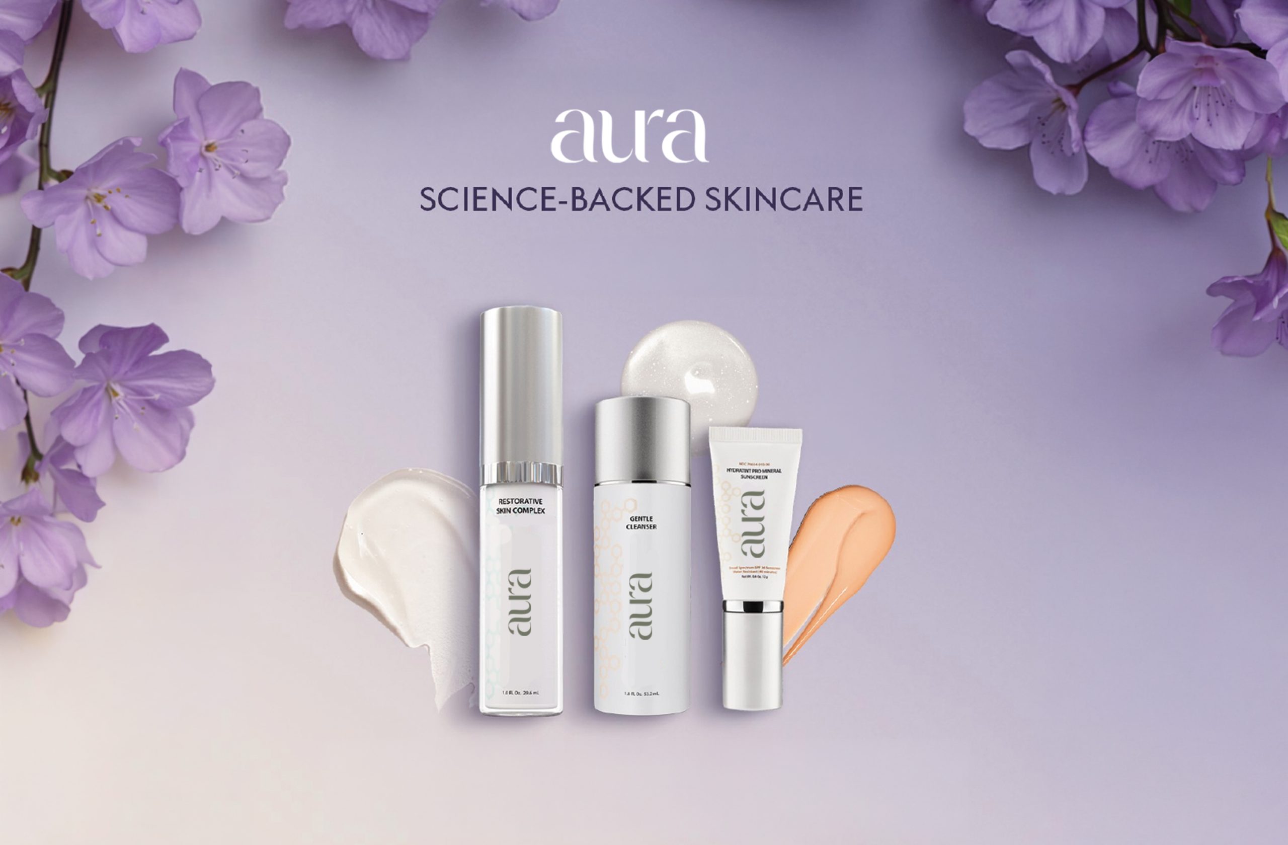
Designed as a brand concept project, this initiative explores crafting a science-backed luxury skincare brand from the ground up—defining its evidence-based brand essence, core clinical pillars, messaging framework, logo, and visual identity to unite sophisticated elegance with dermatological efficacy.
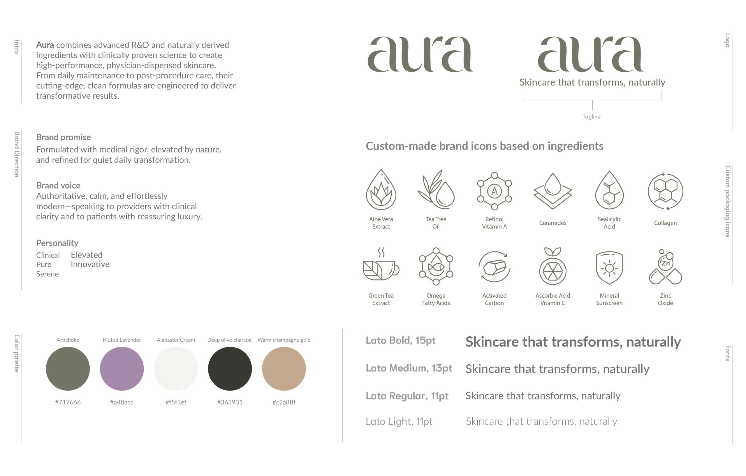
aura combines advanced R&D and naturally derived ingredients with clinically proven science to create high-performance, physician-dispensed skincare. From daily maintenance to post-procedure care, their cutting-edge, clean formulas are engineered to deliver transformative results.

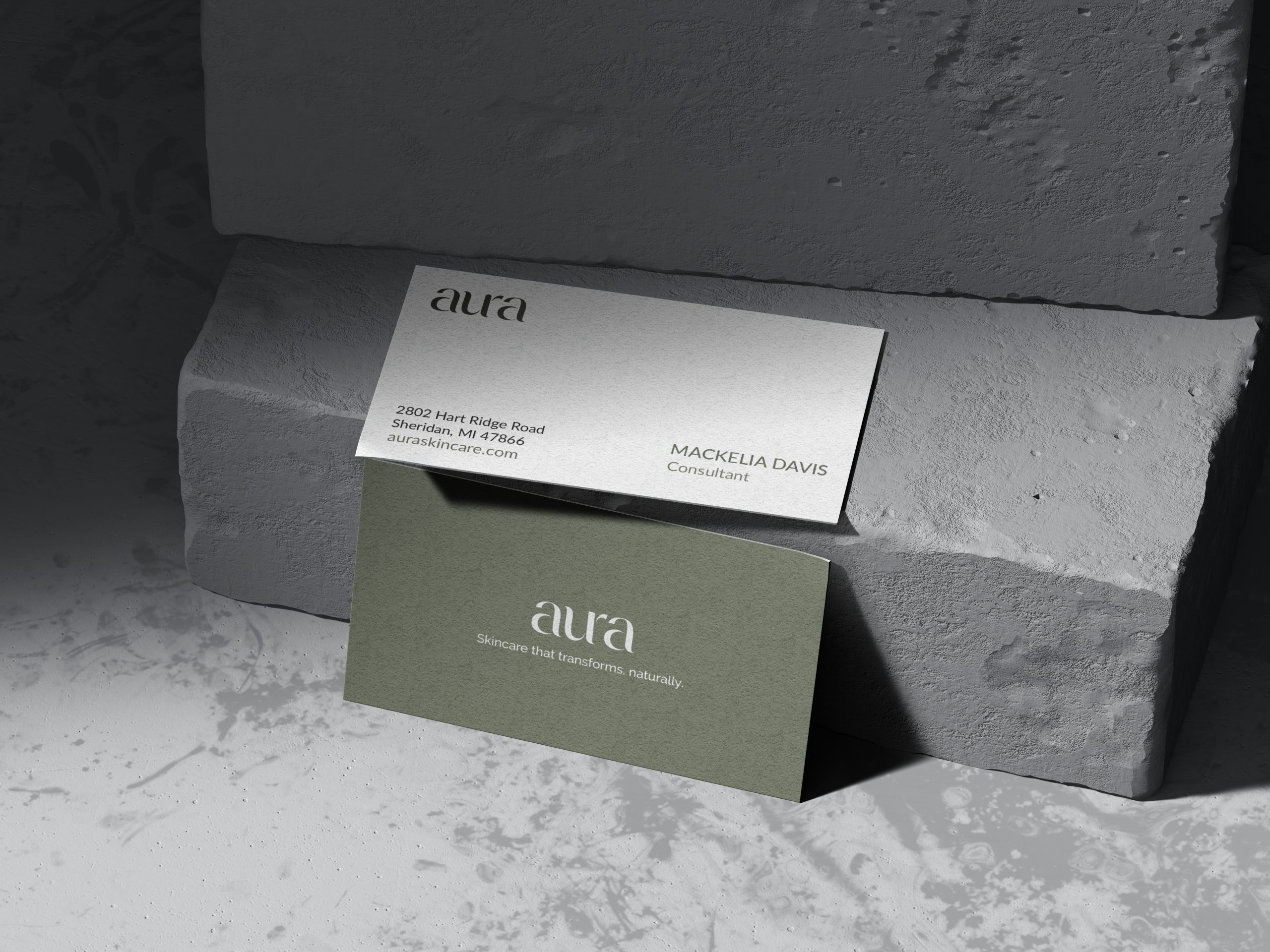
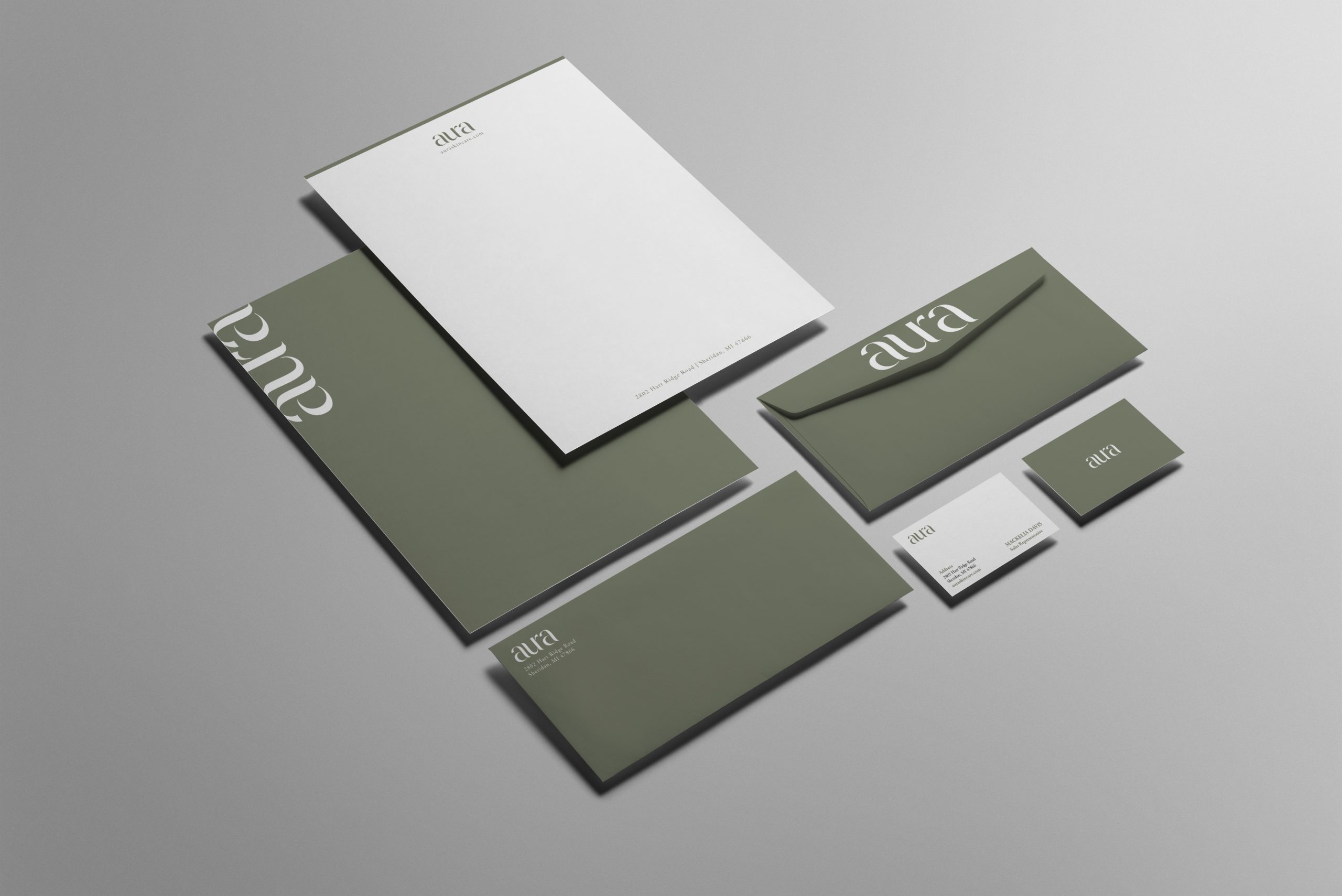
Guided by the concept of “Skincare that transforms naturally,” the design process focused on building a soft, organic aesthetic that feels clean yet elevated. A curated green color palette was selected to embody the clean, plant-derived nature of the products, balanced by muted neutrals to maintain a sense of calm sophistication.
Typography plays a central role, utilizing a clean, lowercase serif typeface to achieve a modern, minimalist look with a gentle, accessible touch.
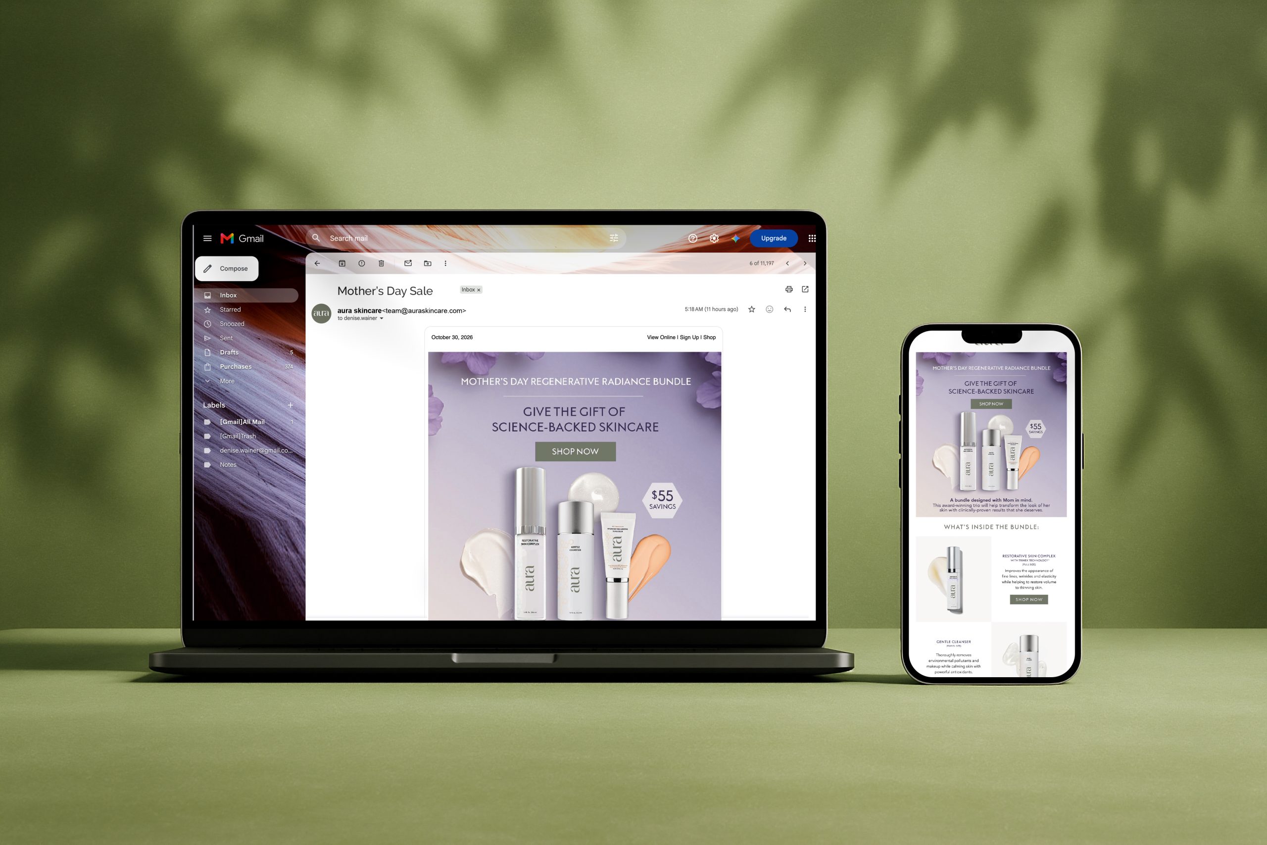
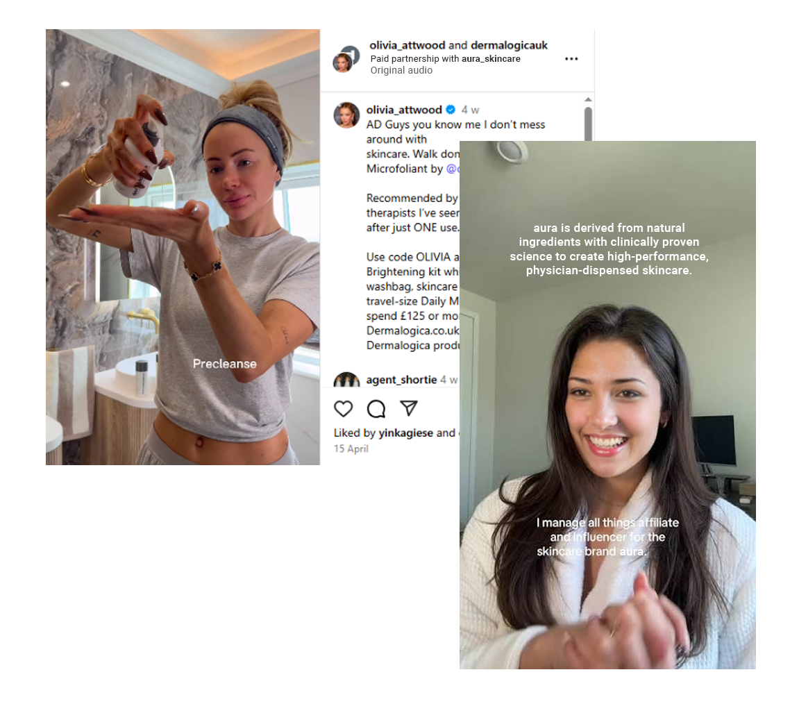
The brand was then brought to life through tactile print collateral—specifying premium, heavy-weight paper stocks for stationery—and translated seamlessly into email and social media templates for a unified, elegant product launch.